Designing a modern website goes beyond making things look attractive. It’s about creating a seamless, intuitive, and accessible user experience. Whether you’re a designer, developer, or business owner, avoiding common UI mistakes can significantly improve how users interact with your site — and ultimately, how they perceive your brand.
Here are some of the most common UI mistakes to watch out for in 2025, and how to avoid them.
With the majority of internet users browsing on mobile devices, designing for desktops first is no longer enough. A mobile-first approach ensures your layout, navigation, and content scale up smoothly from small screens to larger ones. Starting with mobile also forces clarity and simplicity — which often results in a better design overall.
Animations can make interfaces feel alive and engaging. But when overused, they become a distraction or even a performance issue. Use transitions and motion design intentionally — for micro-interactions, page transitions, or tooltips — and avoid animations that don’t serve a clear purpose.
Low-contrast text or very small font sizes continue to affect readability, especially on mobile. Accessibility standards recommend strong contrast between text and background, and font sizes that are legible on all screen sizes. Prioritize readability to create a smooth and inclusive user experience.
When menus are overloaded or poorly structured, users get lost. Clear, minimal, and well-organized navigation helps visitors find what they need without frustration. Use dropdowns, mega-menus, or collapsible sections when necessary — but keep everything intuitive.
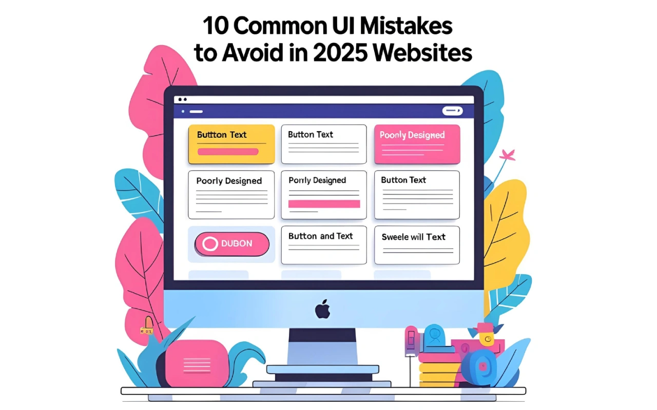
Poor alignment, uneven spacing, or randomly placed buttons can quickly make a site feel unprofessional. Design consistency isn’t just about looks — it directly impacts usability. Stick to a design system or layout grid that ensures harmony and balance throughout the interface.
Popups can be useful for capturing emails or giving important updates, but when overused, they interrupt the user journey. If multiple popups appear at once, it can feel aggressive. Use them strategically, ensure they’re easy to dismiss, and always consider the timing and purpose.
Ignoring accessibility means excluding users who navigate with screen readers, use keyboards instead of a mouse, or need visual contrast to read content. Following basic a11y practices — like using semantic HTML, alt text, and keyboard navigation — creates a better experience for everyone.
What looks good on a MacBook Pro might completely fall apart on a budget Android phone. That’s why testing your website across multiple devices, browsers, and screen sizes is essential. It helps catch layout bugs, interaction issues, and loading problems before your users do.
Generic stock images can dilute your brand identity. Users are quick to spot and ignore them. Using original visuals — whether it’s team photos, office shots, or product demos — adds credibility and trust. If stock images are necessary, choose them carefully and ensure they reflect your message.
A well-structured layout should guide the user’s eyes. When all elements have equal weight, users won’t know what to focus on. Use headings, color, contrast, spacing, and button styling to create a clear visual path from top to bottom. Make it obvious where to click and what matters most.
Final Thought
2025 is the year to design with empathy and build with intention. Avoiding these UI pitfalls not only creates a smoother experience but also builds trust and credibility with your audience. A thoughtful interface is often the difference between a visitor bouncing away or becoming a loyal user.
© . All rights reserved by K.D.S.Hemanth.